Stories
A dashboard answers “what are the numbers”. A Story answers “what do they mean”. It is the same charts, drawn from the same semantic layer, laid out as a single column of narrative: headings, paragraphs, and charts in the order you would explain them to someone.
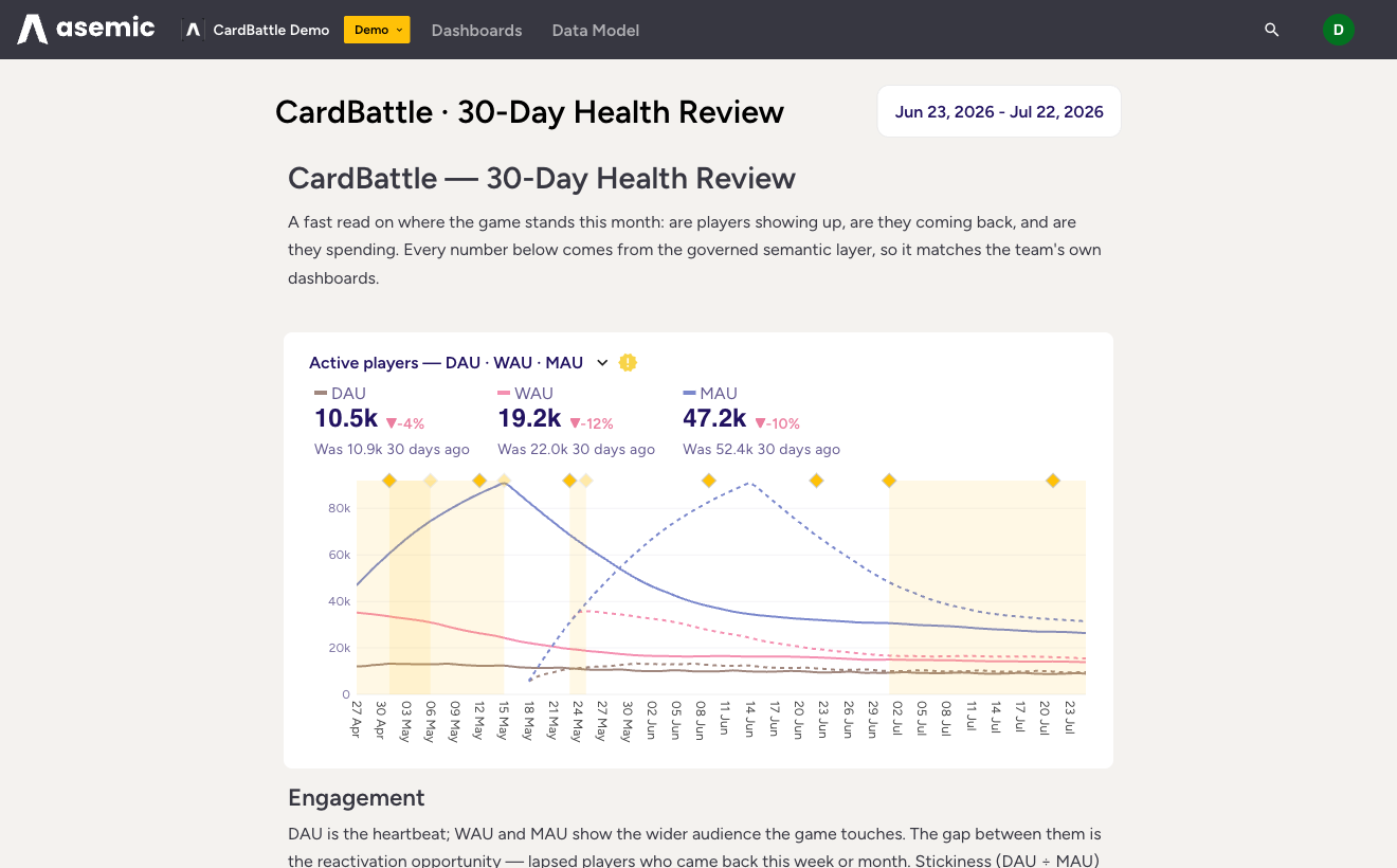
When to use a Story instead of a dashboard
Reach for a Story when the reader needs the interpretation, not just the panel:
- A monthly or weekly review that walks through health metrics in a deliberate order and says what each one is telling you.
- A findings write-up: here is what we changed, here is the cohort it moved, here is the chart.
- Onboarding a stakeholder who needs the context around a metric before the metric lands.
A dashboard is a wall of gauges you scan. A Story is a document you read. The charts are live either way, computed against your warehouse at the period the reader is viewing.
How a Story is built
A Story is a dashboard with text blocks between the charts. You add a chart the same way you would on any dashboard, then add a text block for the heading or paragraph around it, and arrange them top to bottom. Because every chart is still a governed metric, the prose and the numbers cannot drift apart: change the definition once and both the dashboard and the Story that cites it update.
In the library, Stories carry a “Story” badge and a blog-style thumbnail, and they sit under the “Stories” tab.
Sharing
Stories follow the same visibility rules as dashboards. They start private to you; publishing makes a Story visible to the team, and publishing is an Editor right. An assistant can read and even draft Stories over AI chat when your role allows it, which makes “write up this month’s numbers” something you can hand off and then edit.
Next: for a quick, throwaway look rather than a written narrative, use a QuickView.