Dashboards and charts
A dashboard is a set of charts, each one reading a metric from your semantic layer. Because the definitions are shared, the DAU on one dashboard is the DAU on every other, and the same number the AI chat returns. This page covers finding dashboards, reading them, and the view controls that make one dashboard answer many questions.
The library
The Dashboards page is the library for everything the team has built: dashboards, Stories, and QuickViews. The tabs across the top filter by type; search, the visibility filter, and the sort control narrow the rest.
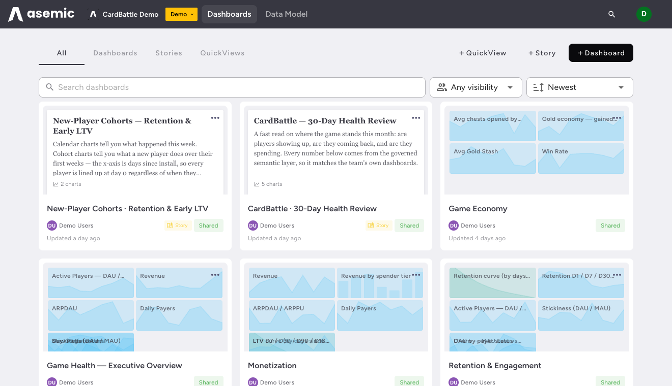
Each card shows a live thumbnail, the owner, when it was last updated, and a “Shared” badge when the dashboard is visible to the team. Create from the top of the page with ”+ Dashboard” (or ”+ Story”, ”+ QuickView”). Cloning any dashboard you can see gives you a private copy to change freely.
View mode and edit mode
Opening a dashboard puts you in view mode: you can change the period, segment, filters, and grouping to explore, and none of it disturbs the saved dashboard. “RESET VIEW” returns to how the dashboard was published. Editing the dashboard itself (adding or arranging charts) is a separate mode, available to the owner and to Editors; if you leave with unsaved view changes, Asemic asks before discarding them.
Reading a chart
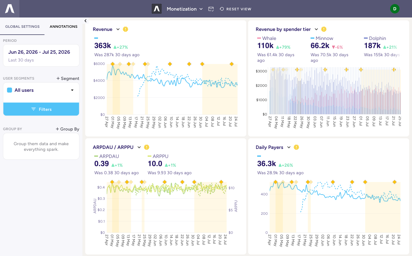
Charts are built to be read at a glance:
- Headline and comparison. Each chart leads with the current value and its change against the comparison period (“363k +27%, Was 287k 30 days ago”). The comparison plots as a dashed line behind the solid current series.
- Breakdowns. A chart can split a metric by a dimension (revenue by spender tier, DAU by platform), shown as stacked or grouped series with a value per group.
- Annotations. Release, campaign, and incident markers sit on the time axis, so a jump in a curve lines up with the thing that caused it.
The view controls
The control rail applies to the whole dashboard at once, so every chart answers the same question together.
Period
“PERIOD” sets the date range, with presets like “Last 30 days” and a custom range. The comparison (“vs previous period”) is what drives the “was X ago” deltas on every chart.
User segments
“USER SEGMENTS” scopes the dashboard to a slice of users. The default is “All users”; ”+ Segment” defines a reusable one (for example, payers, or players from a given country), and the “Filters” control builds the condition. A segment is a saved audience you can switch between; filters are the predicate underneath it. Filters read as chips, so what is applied is legible at a glance and removed with one click.
Group By
“GROUP BY” splits every chart on the dashboard by a dimension in one move, phrased as a sentence so the intent is plain. Group by country and each chart breaks into per-country series; clear it and they recombine. It is the fastest way to turn a dashboard of totals into a dashboard of comparisons without touching a single chart.
When one chart deliberately ignores the dashboard-level segment or grouping, it carries an override badge, so an exception never looks like the rule.
Where the numbers come from
None of these controls run SQL against raw tables. They parameterize the published metric definitions, pushed down to your warehouse. That is why a filtered, grouped, period-compared view is still the team’s agreed DAU, not a new number that happens to share the name.
Next: package a dashboard as a narrative with Stories, or answer a one-off question with a QuickView.