Are Dashboards Dead? No: a Dashboard Is a Cached Answer
Every AI analytics vendor is currently shouting that dashboards are dead. The claim gets attention because it is almost right, and it stays wrong because the people shouting it are selling chat interfaces, not explaining what actually changed.
Here is the subtler thing that happened: dashboards did not die. They became cheap. And when the packaging becomes cheap, you find out what the product was all along.
What a dashboard actually is
Strip the ceremony away and a dashboard is a cached answer. Someone asked “how is retention doing, by country, for the new cohorts?” often enough that it was worth precomputing the answer and pinning it to a wall. That is the whole idea. It is a good idea; caching frequent questions is how every efficient system works.
The problem was never the cache. The problem was the cost of writing to it. Filling a dashboard historically meant a data engineer shaping tables, an analyst hand-writing SQL with the definitions inlined, and a BI developer arranging the result. Because the packaging was expensive, the packaging became the deliverable: teams measured analytics output in dashboards shipped, and the definitions that made the numbers mean anything lived inside each dashboard’s queries, copied, drifted, and argued about later.
That is the world where “whose DAU is right?” is a recurring meeting. The cache entries were hand-carved, so no two of them agreed.
No, dashboards are not dead
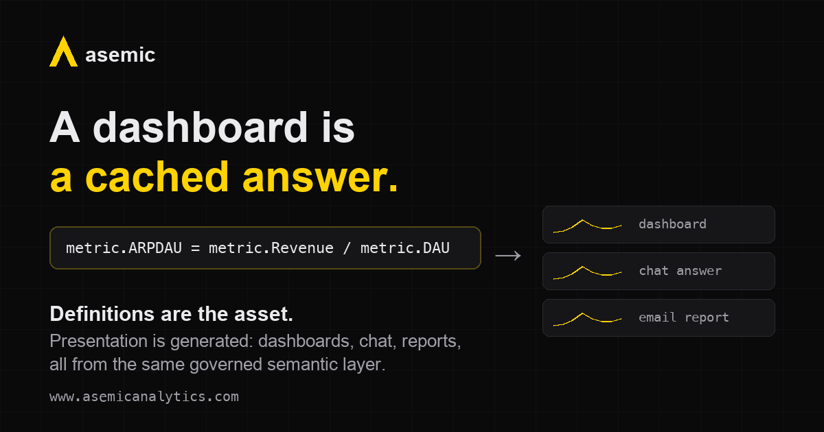
What the AI moment actually changed is the cost of generating a presentation. When metrics and segments are defined once, legibly, in a governed semantic layer, any surface can be produced from them on demand. Ask an AI assistant a question and a chart renders in seconds, speaking the same definitions as every other chart. Subscribe to a dashboard and it arrives by email on a schedule. Pin the questions you ask every morning, and that pinned set is your dashboard.
The dashboard survives; it is genuinely useful to have your frequent answers pre-arranged. What dies is dashboard work: the packaging step that consumed analyst time and produced nothing durable.
So the honest version of the trope is this: dashboards are becoming outputs, not assets. Cheap to make, cheap to discard, regenerated at will. Nobody mourns packaging once it is free.
When presentation is free, definitions are the asset
Turn the inversion around and look at what is left holding the value. If every chart, chat answer, and report is generated, then the only durable artifact in the system is the definition layer: what counts as active, when day 0 starts, which revenue counts, one legible line per metric that a human can read and sign off on.
That layer is where the actual analytical work was hiding all along. Deciding what to measure, how to segment, and what comparisons are honest: that is analysis. Arranging the results in a grid never was. A team that stops carving cache entries by hand gets that time back and spends it on metrics and segments, which is to say, on the questions.
Flexible because standardized
There is an apparent paradox here worth naming, because it is the part that does not come free with an AI bolt-on. Governance and flexibility usually trade off: lock definitions down and lose agility, or move fast and watch every dashboard invent its own DAU.
Standardization done at the right layer dissolves the tradeoff. Because a metric means exactly one thing, every interface can speak it safely: dashboards, ad-hoc exploration, scheduled email, and an AI assistant all compose the same nouns without breaking their meaning. The flexibility is not in spite of the standard; it exists because of it. A new segment, a new breakdown, a new surface: none of them require renegotiating what the numbers mean.
Our MCP integration made this concrete for us. Exposing Asemic to AI assistants was a matter of a few small tools that speak in metrics, dimensions, and cohorts, because that is the vocabulary the system already had. There was no translation layer to build and no prompt full of schema documentation to maintain. Tools that grew up dashboard-first face this problem from the other side: their vocabulary is the packaging, so their AI integrations end up aimed at the developers who can bridge the gap. The clean interaction is not a chat feature; it is a property of where the definitions live.
How to evaluate analytics tools now
The practical takeaway, whether or not you ever use Asemic: stop evaluating analytics tools by their chart libraries and dashboard builders. That layer is being commoditized out from under every vendor at once, ours included. Evaluate the definition layer instead: whether metrics are defined once or per-chart, whether a definition is legible enough for a human to verify, whether segments compose without changing meaning, and whether the vocabulary is exposed to whatever interface comes next.
The packaging will keep getting cheaper. The definitions are what you will still own in five years.
The same layer is what makes the next question answerable at all: not “what moved” but “why did it move.” That is what we are building with causal decomposition, and it only works because the inputs are governed. If you want to see the definitions-first approach on your own data, book a demo; 45 minutes, no sales loop.